


BRAND REFRESH
In Alberta’s crowded energy market, ATCO Energy set out to stand apart by expanding its offerings to include home services — prompting a brand refresh that would balance ATCO’s trusted heritage with a renewed sense of energy and personality. The result positions ATCO as a brand that empowers homeowners to truly own their homes through simplicity, clarity, and confidence.
ILLUSTRATION / BRAND IDENTITY
Agency:
McCann Canada
ECD: Brian Allen
CD/CW: Bill Schaefer
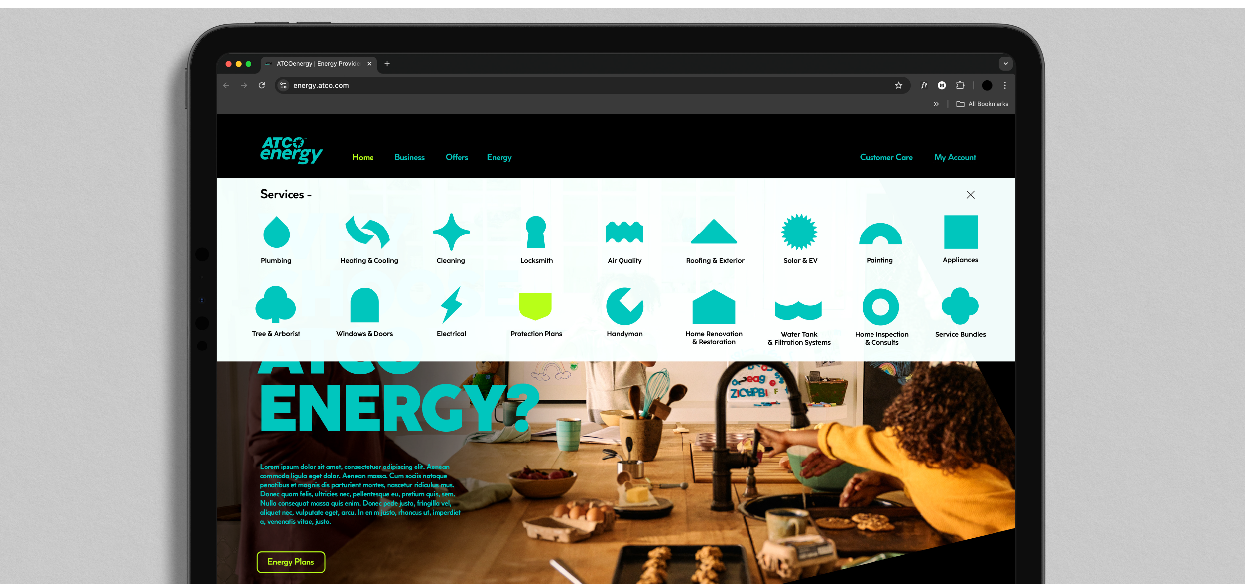
At the heart of the refreshed identity is the ATCO Spark, symbolizing the company’s core energy products — electricity and gas. The spark represents the beginning of something good — a catalyst for comfort, control, and empowerment. It embodies ATCO’s role as the spark that sets transformation in motion, turning a house into a home.
The refreshed colour palette builds on ATCO’s familiar green, contrasted with rich black and accented by a vibrant electric lime. This “spark” hue injects new energy into the brand and reinforces its modern edge. The angular geometry of the spark also inspired a flexible graphic container used across layouts — helping organize content while reinforcing the spark as a recognizable brand element.
A custom icon system was developed to complement this visual language. Referencing the aesthetic of the Spark icon, each illustration was designed to be as minimal as possible while clearly communicating the essence of the service it represents.
When combined with the updated typography, photography style, and refreshed brand voice, these elements create a flexible and future-ready identity system. The new brand kit provides ATCO with the tools to maintain a consistent and cohesive presence across every touchpoint — from digital platforms to print communications — ensuring the brand feels unified, recognizable, and full of energy wherever it appears.
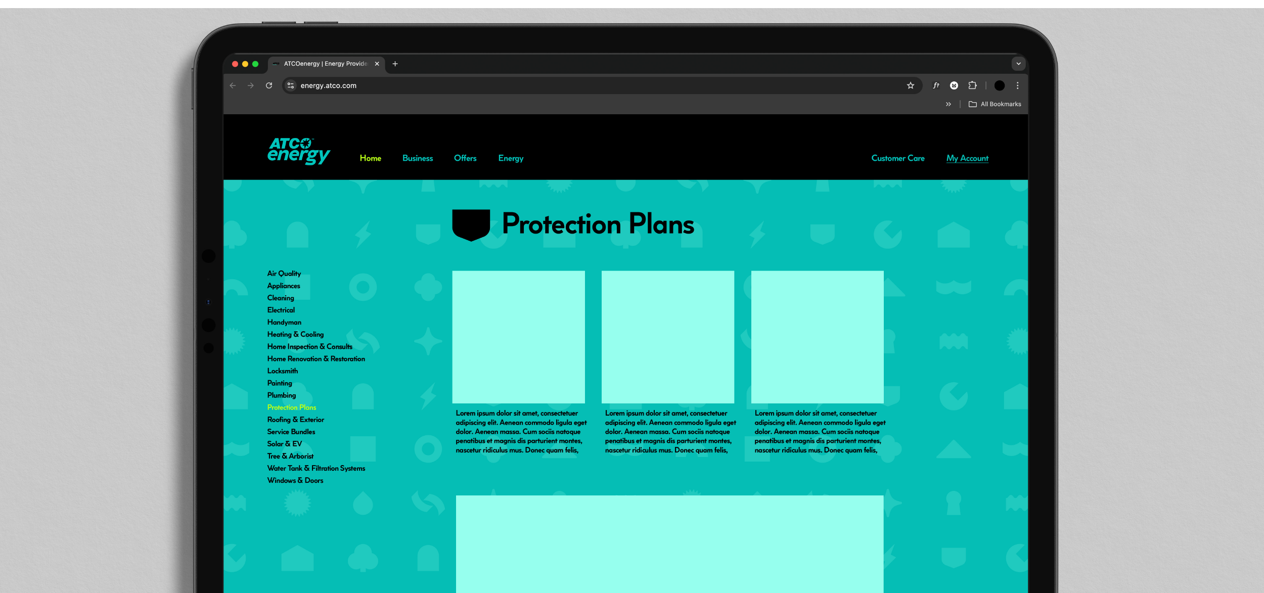
To extend the system, a step-and-repeat pattern was developed using the full icon set. This pattern can be applied as a background element across the website’s service pages and other brand materials, adding depth, energy, and personality while maintaining a consistent brand look and feel.