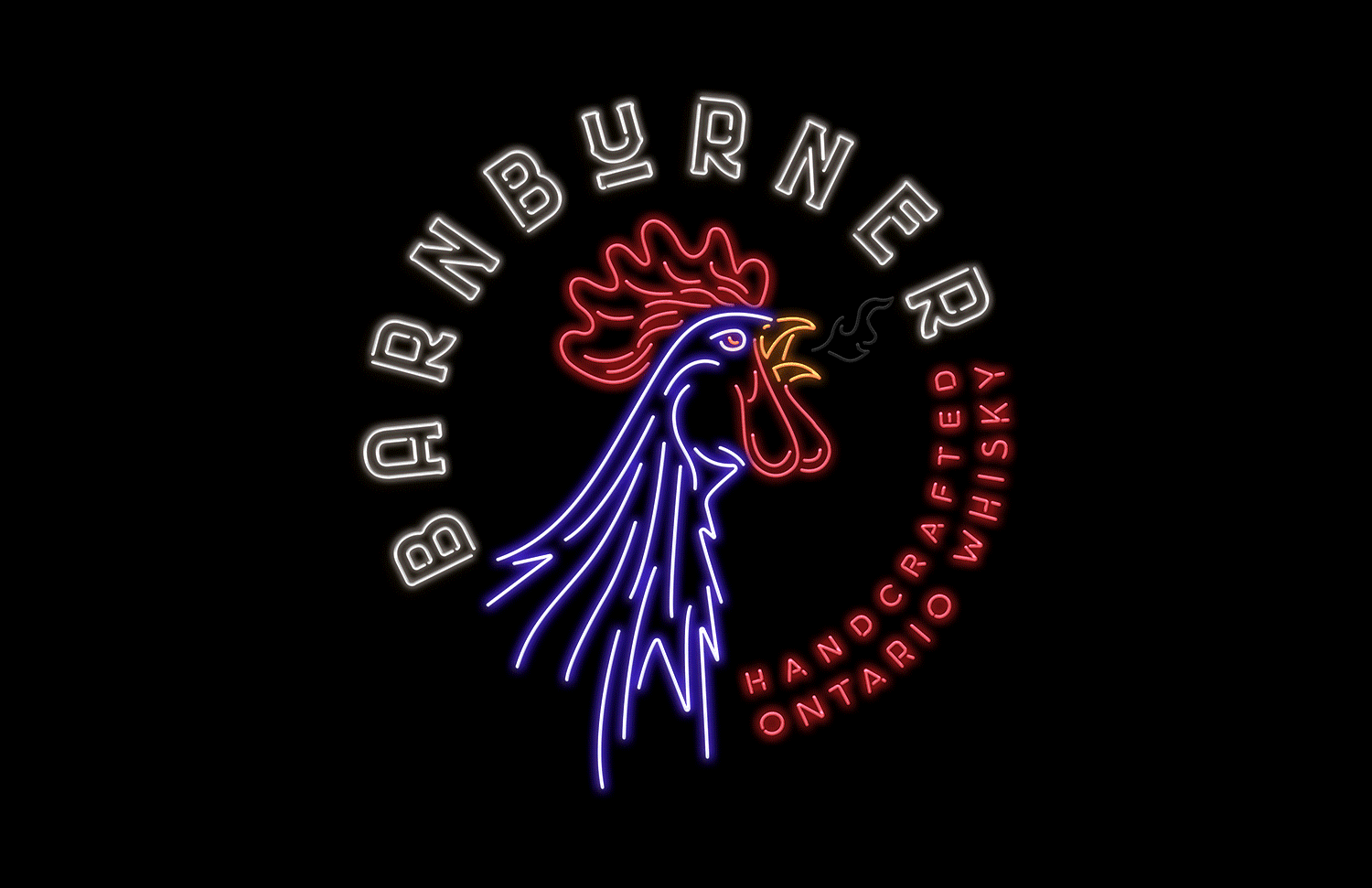


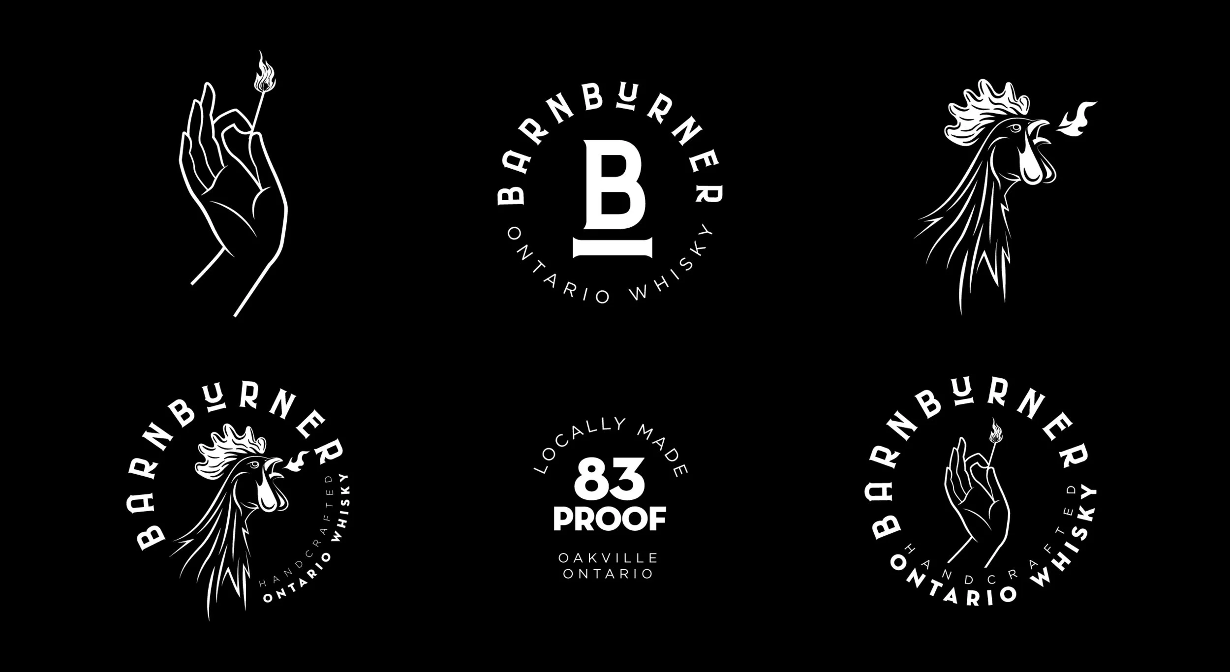


BARNBURNER
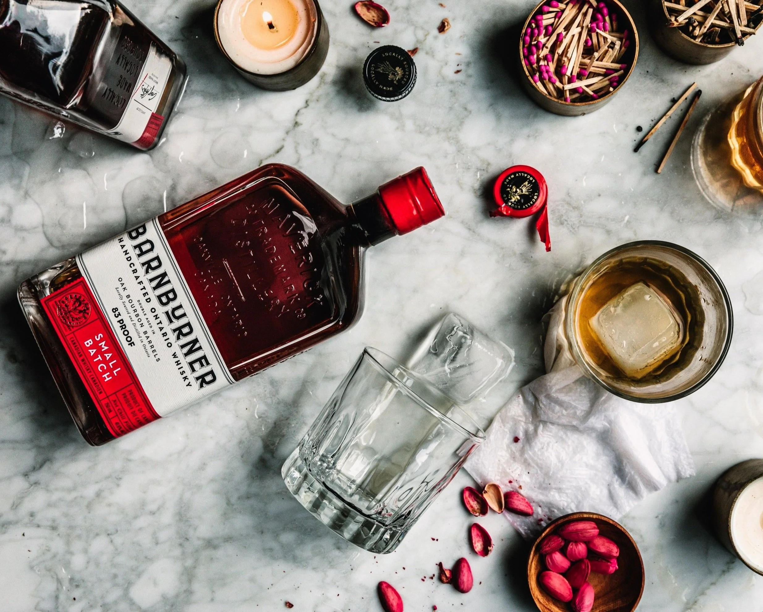
Maverick Distillery came to us with a challenge: develop a name and visual identity for their new craft whisky that would stand out on the shelf, punch above its price point, and capture the rebellious energy of its audience. The result was Barnburner — an unpretentious, bold whisky with a top-shelf taste and a low-brow swagger.
As part of the design team at McCann Canada, I helped contribute to the brand’s creation from the ground up — from naming and brand strategy to visual identity, packaging, and beyond. The name “Barnburner” struck the right balance between fun and fire — a nod to both rural roots and wild nights.
I designed the bottle and packaging to reflect that same spirit: gritty, bold, and full of personality, with custom typography and illustrative touches that feel handcrafted without being cliché. We extended the brand into lifestyle territory with custom merch, barware, and signage that helped cement Barnburner’s place as the go-to party whisky with real character.
ILLUSTRATION / BRAND IDENTITY / PACKAGE DESIGN
Agency:
McCann Canada
Design Director:
Stephen Tasker